Tuesday
In the world of HTML coding, people will frequently talk about using "containers" and "wrappers." In loose terms, these refer to any set of elements that are grouped (contained or wrapped) together so that they can be addressed collectively in CSS. With CSS grid, it is common to wrap everything inside the body in this way. To do that, right after starting the body, add ‹div class="wrapper"› and put the stop tag right before the stop tag for the body. I will demonstrate this in class so you can see it in context.
With this done, in our CSS we can apply styles to everything in the grid by selecting .wrapper {}. The . in front of the wrapper tells the computer that instead of selecting a tag, we're selecting a subset of tags that have a specific class name.
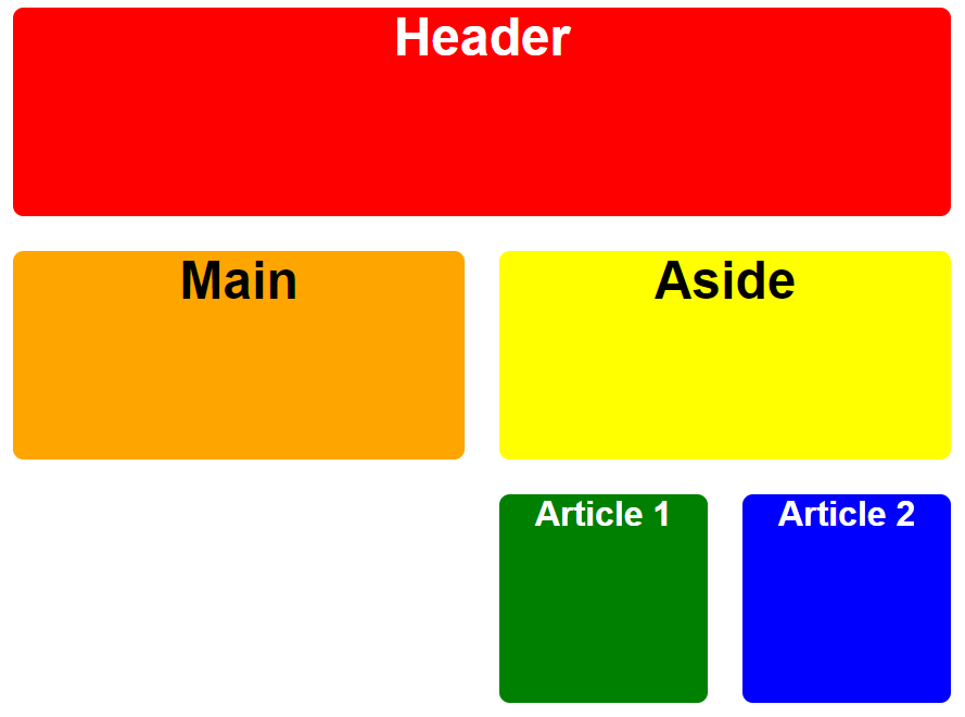
In addition to defining the wrapper, we need a second layer of selectability. We'll do that by adding class="box" to each of our semantic tags. That will allow us to select the cells in our grid without selecting the gaps between the cells. We also want to be able to select individual cells or areas, and we can do that by adding semantic class names to the semantic elements. Thus, the header should be coded as ‹header class="box header"› so that it receives all the box styling and all the header-specific styling. Apply this kind of logic to all of your semantic tags in the grid.
The last thing we'll do today is to set the display to grid in CSS: .wrapper { display: grid ; }. Spend the rest of today trying to figure out the remaining details that need to fill out the CSS.