Wednesday
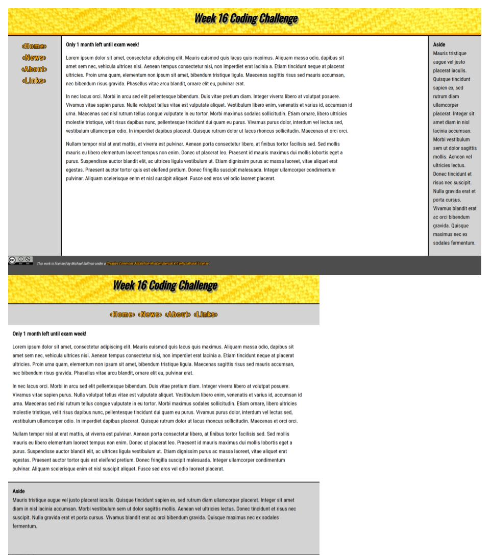
Today we're going to take a few steps to establish the responsiveness of our Web page for this week's coding challenge. Previously, we had defined grid-area with numbers (row start / column start / row end / column end). For our responsive grid, we're going to change things up a bit. We'll start by defining grid-template-areas, then we'll move on to change our grid-area values to the names we just added to the template, then we'll use a media query to create a break-point between display sizes.
I realize this seems like a lot of new content to throw at you all at once, but the concepts are all closely related and the implementation is straight-forward. In some ways, it is visually more intuitive than the method we have been using, so that should make it easier to learn and to use.
