Wednesday
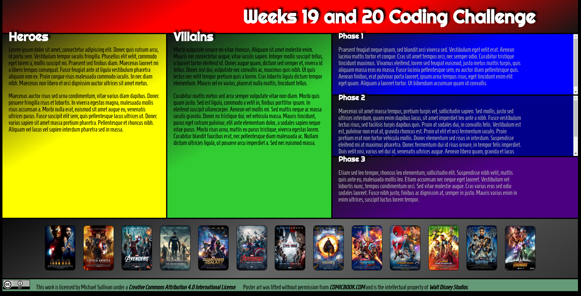
When defining the grid template (row heights and column widths), we have typically set them in terms of a number of rem. On several occasions I've also suggested using fractional distances (fr). Today we're going to apply a third option: auto. We've already used auto to center elements through the margin property, so we have some sense for how it works. In CSS-Grid, we can apply auto to our overflow property (so that the scrolls will only appear if they are needed) and we can apply it to our grid-template-rows property so that we can get the footer row to automatically sit at the bottom of the display.
