Reuse versus Refuse
The mantra of sustainability is "reduce, reuse, recycle." Those are listed in order of priority because if you can reduce the amount of resources you need, then there is less to figure out how to reuse or recycle, and if you can reuse your own materials, there is less you need to find a new recycled home for. Each sustainability reform you implement should reduce your material needs as much as possible, then seek to reuse what is left over, and finally find recycling pathways for whatever cannot be reused.
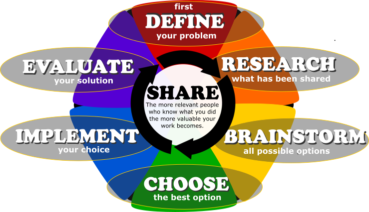
You will notice that I often counsel you to avoid wasting limited resources - that's the REDUCE part. We also upcycle materials and re-use things like tools and the ropes - that's the REUSE part. Getting people to RECYCLE, though the least important of the three sustainability reforms, is still worth our effort. So today we're going to get into a design exercise that combines sustainability reform efforts with good design practices. Specifically, we're going to research the 7 plastic recycling codes (Google that phrase to turn up good results), then we're going to learn which types of plastic Rumpke accepts for recycling, and finally we're going to design signage to clearly communicate that need. Each year I challenge STEM 2 students to create a design worthy of putting up in my classroom. Nobody has managed to clear that bar yet, so your challenge remains. Make this year the year signage goes up in here.
In the same way that sustainability has 3 prioritized tiers of effort, so too with design work. When designing signage, accomplish as much of your messaging goal with SHAPE alone; if that's not enough, add COLOR; if that's still not enough, add TEXT. Shape will reach the most people - it gets past language barriers, color-blindness, and the fading of pigments over time. That's what makes it the most important component of all design work; it is fundamental. Everything else is decoration around shape. Text is the last element to add; I would go so far as to say that if you can avoid text altogether, you have achieved the pinnacle of sign design. But do not sacrifice your message in pursuit of that pinnacle. If your sign does not clearly communicate your intended message, your sign is a design failure. The problem with text is that it takes time for viewers to read through. Even if a viewer is literate, knows the language in which the sign is written, and has the time to read it, most people tend to glance at signs rather than read them carefully. Few will spend the time or effort needed to catch details in a sign's wording. But most will grab the gestalt communicated by shape and/or color and work with that effectively. So keep all that in mind as you design a recycling sign to put up near our recycling bins.
